
I’ve been spending a lot of time working inside the Microsoft ecosystem lately, and if there is one thing that has consistently bugged me about Copilot, it was the sheer visual noise. It felt like every time I tried to use it for serious work, I was met with glowing gradients and flashy animations that felt more like a toy than a productivity tool.
Well, it looks like Microsoft finally realized that less is more. They just announced a massive design overhaul for Microsoft 365 Copilot, and I have to say, this might be their smartest UI update yet. Instead of adding more bells and whistles, they stripped it down to be cleaner, more text-focused, and highly professional.
Here is what caught my eye while analyzing this new update and why I think it matters for our daily workflow.
The End of the Rainbow: Why Monochrome?

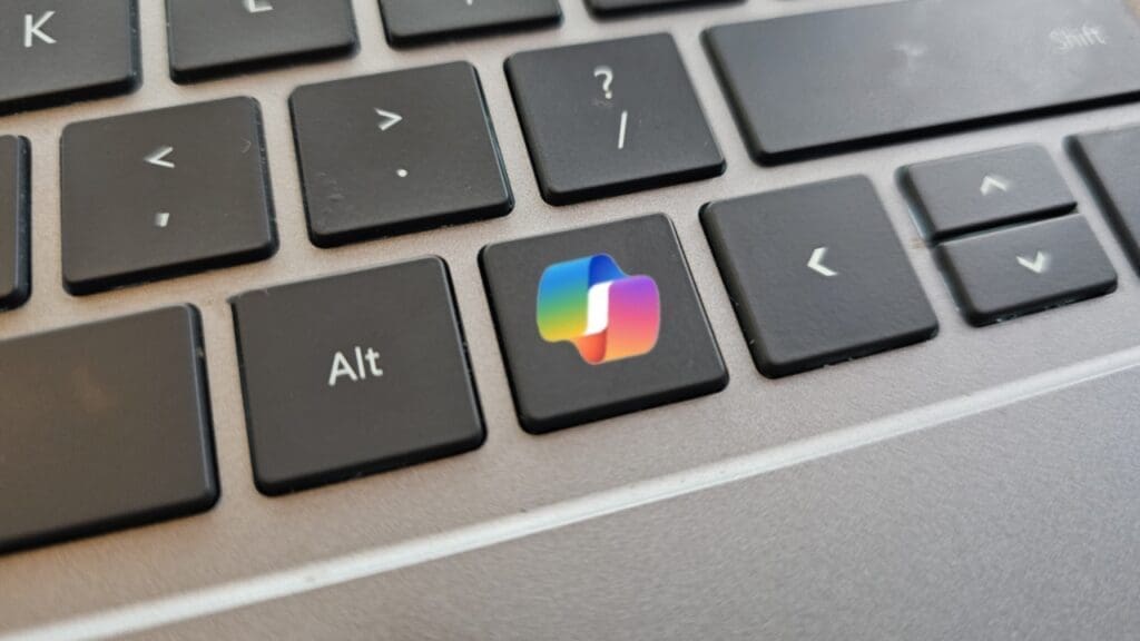
The most striking change in this update is the complete removal of those vibrant, glowing colors we’ve come to associate with AI assistants.
Black and White Focus: The new interface relies heavily on a clean, monochrome palette.Reduced Distractions: Microsoft stated that this approach significantly improves readability. When you are staring at an Excel sheet for three hours, the last thing you need is a neon-colored AI sidebar screaming for your attention.
I completely agree with this move. When I am trying to edit a document or analyze data, I want my tools to fade into the background, not compete for my focus.
The Dynamic “Prompt Surface”

Another massive improvement is how we actually interact with the AI. Microsoft is introducing what they call the “prompt surface.”
Instead of a static, clunky text box, this new input area dynamically expands based on what you are typing. It feels much more organic. If you are asking a simple question, it stays out of the way. But if you need it to analyze a massive document or generate a complex graph, it adapts to give you the space and direct tool shortcuts you need right there on the screen.
Consistency Across the Board
If you’ve used Copilot across different apps, you know the pain. It acted and looked slightly different depending on whether you were in Word, Excel, or PowerPoint. It was jarring.
With this update, Copilot finally has a unified design language. The AI now lives in the exact same spot, operating with the exact same side-panel layout, no matter which Microsoft 365 app you have open. It creates a seamless flow when you are bouncing between writing a script and checking a spreadsheet.
My Take: Transitioning from a “Novelty” to a “Necessity”
Right now, this minimalist redesign is only rolling out for the enterprise-focused Microsoft 365 versions. If you are using the consumer version or the mobile app, you’ll still see the colorful, bubbly interface.
But looking at Microsoft’s broader strategy, this feels like a major pivot. They are actively re-evaluating where Copilot sits in Windows and how it integrates into our lives. By stripping away the flashy colors in their professional suite, Microsoft is sending a clear message: Copilot is no longer just a cool AI experiment to show off; it is a serious, foundational tool for getting work done.
I’m thrilled about this stripped-down approach, but I know some people loved the futuristic, colorful vibe of the original AI interfaces.
What do you guys think, Spartans? Do you prefer a sleek, distraction-free black-and-white interface for your AI, or do you miss the vibrant, glowing designs that make it feel like “the future”? Let me know your thoughts in the comments!


